Unleash the Revolution: How Jay Darvishian is Redefining Fashion with Wild, Rebellious Designs!
Share
Each year, the Barcelona-based fashion non-profit MODA-FAD throws down the gauntlet for students everywhere, giving them the golden opportunity to showcase their work at the city's iconic Disseny Hub. With a focus on sustainability, the 2024 theme is nothing short of a revolution—decolonisation! The challenge? Titled 'Carnival of Insurrectionist Couture, a Decolonial Practice', it's a bold call to overthrow old-school norms, redefine fashion as rebellion, and shake the foundations of Eurocentric frameworks.
Meanwhile, design visionary Jay Darvishian was handed the reins to craft the challenge's visual identity. Echoing the decolonisation theme, Jay set out to dismantle the Eurocentric design shackles that have dictated "good design" for way too long. Rigid grids and typographic traditions? Watch out. Jay dived deep into research, launching a full-scale interrogation of mainstream theories and frameworks. His mission? To dissect, connect, and simplify until a breakthrough concept bubbled to the surface. The mission? Break down established norms—a groundbreaking roadmap that shaped his fiery proposal.
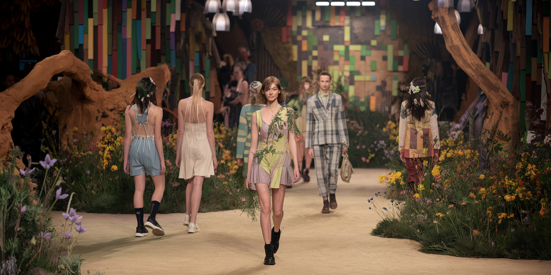
In pitching to the clients, Jay underscored the crucial need to reconnect with Mother Nature. Indigenous folk tales worldwide echo humanity's deep ties with the natural world, a connection distorted by the relentless capitalistic exploitation of resources. So, where did Jay find his muse? Nature, of course—specifically, the wild and wonderful world of wildflowers. With crayons in hand, he sketched bold, abstract shapes that soon blossomed into the identity's rebellious backdrops, pixelated in a cheeky snub to the Western ideals of image-making.
And then came the grid: "Design is the shiny chariot of capitalism, ripe for critique," he proclaimed. Jay's instinct screamed to banish structure—stretching typefaces and wrecking grids altogether. "Our final strategy forced the type—a Eurocentric design staple—to make nice with abstract forms, sending a clear message: humans should shape to nature, not the other way around."
By tossing aside stiff structures and embracing wild, unpredictable forms, Jay's identity paints a picture of a world where design isn't a slave to the market, but a friend of nature and intuition. Sustainability was the cornerstone of this vision. Jay, alongside creative partner Laia Xixons, got scrappy with project materials and stuck to mostly digital formats to dodge print-heavy production. "Our planet's resources are finite, so smart and thoughtful use is key," he explained. The result is an identity that simply won't fall in line—eschewing familiar paths to ride the same wild waves as the ever-evolving natural world.
